


Question:
How diverse can the longevity profile of pension plans in Canada really be?
Answer:
Very diverse. What’s more, this diversity is not easily predicted by any single factor (such as sector) in isolation. However, consideration of the characteristics of individual plan participants, such as their lifestyle and affluence, can allow the diversity of longevity to be recognized and understood.
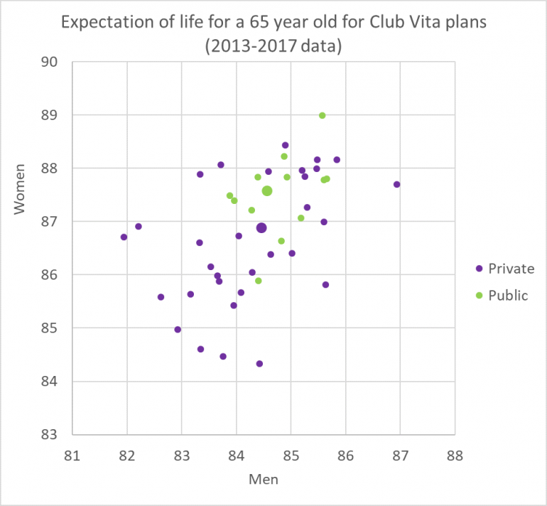
In the chart below, each dot represents a pension plan in Club Vita Canada and plots observed life expectancy of men and women from that plan. Green dots represent plans from the public sector and purple dots represent plans from the private sector, with the larger dots showing average life expectancy for the sector. Plans with low life expectancy appear in the bottom left and plans with high life expectancy in the top right.

Key takeaway
- It is risky to make broad assumptions about the longevity of a pension plan’s membership based only on high level information about the organization, such as the industry, sector or geography.
The chart illustrates a powerful message – there is no such thing as an ‘average’ pension plan in longevity terms and, as a result, unadjusted generic longevity tables (designed to apply to many plans) will not be a good fit for the majority of plans. Even looking at the different sectors on their own will not capture this diversity.
What do you think?
Saeed Ahmadi